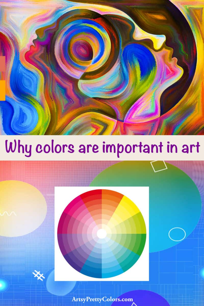
Why Colors Are Important In Art
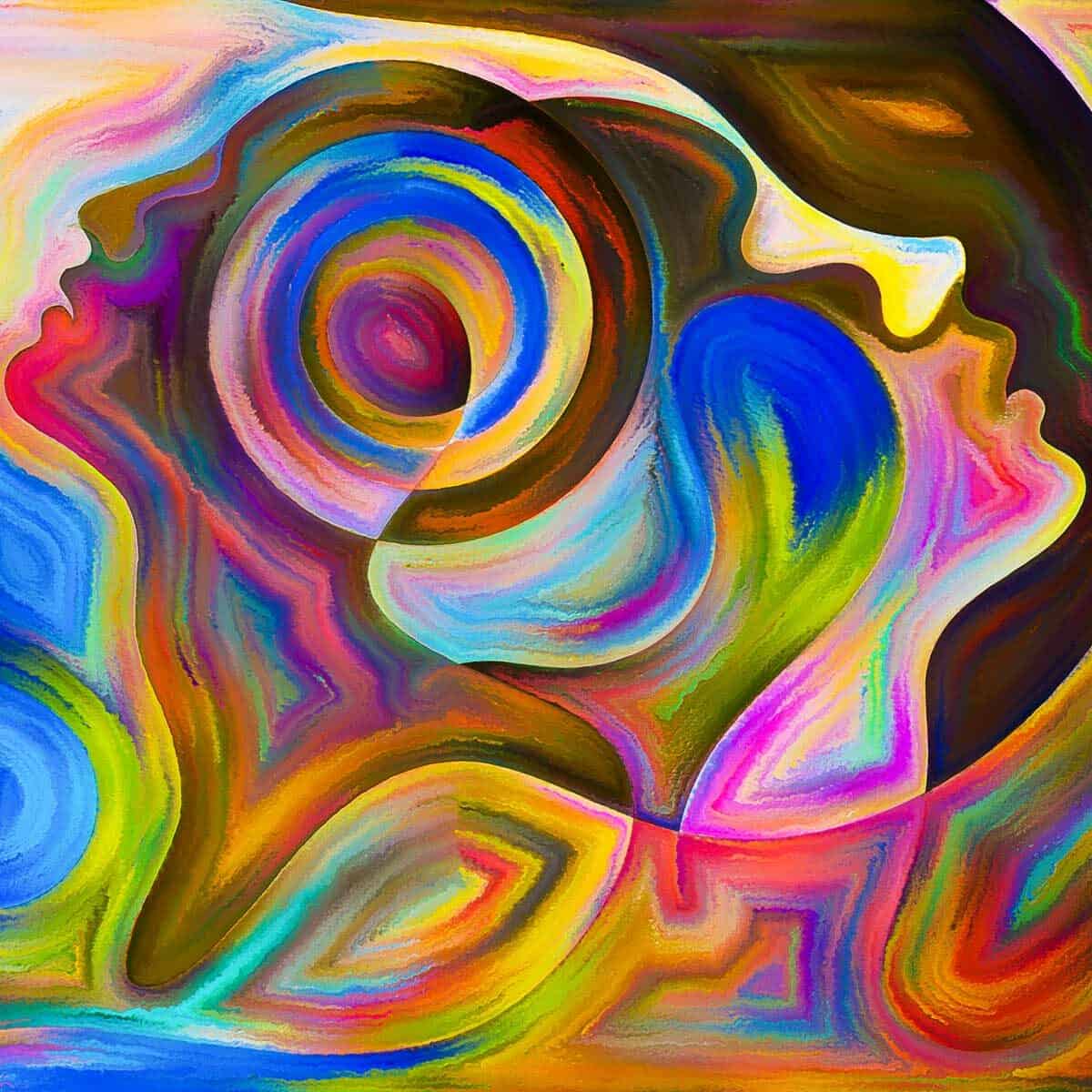
Colors are important because they have the power to shape our emotions and influence our perceptions of art.
With the right colors, an artist can create an atmosphere of beauty and happiness; the same artwork can appear bland and drab with the wrong colors.
We explore why understanding colors is essential and how to use them to our advantage as budding artists.
When you realize how different colors can elicit different psychological and physiological reactions from people, it’s mind-blowing.
From graphic designers to social media experts, individuals and companies can use the psychology of color differently to elicit specific emotions in their target audience.
Why Colors Are Important
This innate connection between color and emotion can affect decision-making. It can have a lot of power when it comes to branding.
The simplest color changes can mean the difference between someone clicking a button versus not clicking it.
Colors can change someone’s perception of specific products or businesses.
Certain colors can lead to subconscious judgments about the subject. Depending on the situation, the vast majority of designers will consider the psychological effects of color on human beings.
They could create poor user experience and brand recognition if they don’t.
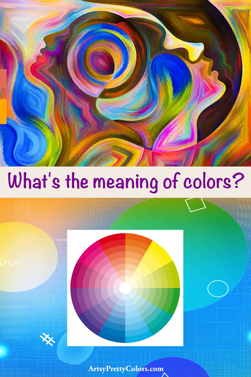
What Is Color Psychology?
Most studies on the importance of color have been done for practical purposes and rely heavily on anecdotal evidence and case studies from companies and designers.
We start to associate colors with feelings in early childhood, when we begin to learn our colors.
And although the reason for why specific colors affect the way we feel isn’t extremely clear, color selections will differ from person to person.
And many factors may play into the personal preferences of color, such as age, culture, gender, and more. Personal experiences surrounding colors can alter everything.
But while perceptions of color are subjective, it is possible to predict how most people will respond to color. This makes color a potent tool.
For instance, the color green is often associated with nature and growth. Blue is often associated with a calming effect due to its close connection with water and the sky.
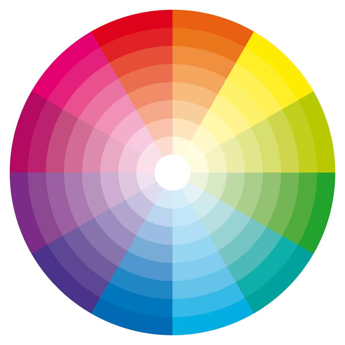
What Is Color Theory?
Color theory guides color mixing, resulting in a combination of specific colors.
It uses primary, secondary, and tertiary colors based on the color wheel.

Using some user-friendly formulas, you can create color combinations that complement one another well.
These are often referred to as color harmonies or color schemes.
Common Color Schemes
For some coloring practice, here are some coloring pages to let your creativity flow and play with colors, the adult dragon coloring sheets and coloring pages of shoes.
The Importance Of Meanings In Color
While there is no hard or fast rule, colors are associated with different emotions.
The use of colors can affect emotions and moods for those viewing a color palette.

Warm Colors
Warm colors like red, yellow, orange, and variations evoke warmth.
Generally speaking, they convey feelings of optimism, enthusiasm, energy, and passion. However, they can also give off negative feelings.
Red is associated with love, passion, and lust but also with danger and anger. It can also have a physiological impact on people, including raising heart rate and respiration.
The color orange is often connected with seasonal transitions (think fall foliage!).
It’s generally perceived as energetic and positive but can also be associated with warnings.
The color yellow is the happier hue of warm colors, closely associated with sunshine and hope. It can also be connected to cowardice and caution.
Cool Colors
Cool colors, including blue, purple, and green, and their variations, are commonly known for their calming effect.
They can be soothing and relaxing, but on the other end of the spectrum, they can also represent sadness.
The color blue represents honesty, loyalty, peace, and calmness. Think about how often it shows up in corporate branding. It can, however, be related to sadness as well.
The color green represents growth, nature, and new beginnings. In darker shades, it’s also connected to money and stability.
The color purple has been associated with luxury and royalty for a long time, but also with mystery.
Don’t forget to Pin it for later!
Neutral Colors
Neutral colors, such as brown, black, and white, and their variations are often referred to as earth tones.
While they are often paired with warm or cool colors, they can also stand on their own quite well.
They can be seen as powerful and pure and evoke everything from peacefulness to boredom.
The color black is elegant and sophisticated but can also be representative of sadness and death.
White is connected to purity, innocence, and cleanliness.
Gray is one of the most flexible neutrals. It can be either warm or cool and traditional or modern.
Brown is solid, dependable, and can be associated with nature.
Unique Circumstances
Cultural Differences
However, it’s important to note cultural differences when using color, especially in relation to brand identity or similar situations.
A prime example is that most western cultures associate white with innocence and purity.
However, in other cultures, particularly eastern cultures, white is associated with death, mourning, and sometimes even bad luck.
Taking the extra time to research cultural meanings of colors before committing to a color palette is an important factor.
Different Shades
Very subtle changes can have a significant impact. In general, blue is considered calm and peaceful.
However, bright blues may be considered more modern and energetic, while dark blues may be regarded as more loyal and traditional.
Another subtle change is different shades of color combinations. Red and green are complementary colors, but right next to each other can be visually displeasing.
But lightening the red and transitioning the green to a different shade can be exceptionally striking.
Conclusion
The use of color is important, and the insight into why can help contribute to a positive user experience.
For more help on furthering your art skills, check out this article with useful tips on how to practice drawing and how to find your particular style of drawing.
Don’t forget to Pin it for later!